
Continuity
Continuity was conceived as a software-facing brand and product system that needed to communicate seamless persistence from first glance to product interaction.
Continuity was conceived as a software-facing brand and product system that needed to communicate seamless persistence from first glance to product interaction.
YEAR
2026
ROLE
BRAND DESIGNER
CREATIVE STATEGIST
SERVICES
BRAND DESIGN
We positioned Continuity as the quiet backbone of reliable digital infrastructure — a product for mid-market teams that value compounding reliability over flash. The strategy was to let the motion itself become the brand: every transition reinforces continuity; every interface pattern reads as a deliberate, considered choice with no dead ends. We set three rules: zero jarring state changes are prohibited, grids stay visible across pages, and transitions match the grid, and every primary motion is consistent with the mark’s structural geometry. This moved the positioning from “just another SaaS tool” to a platform that earns trust through micro-interactions.
We developed the visual language in Figma, translated that logic into a React build, and used motion studies to test how the interface could reinforce the idea of continuity.
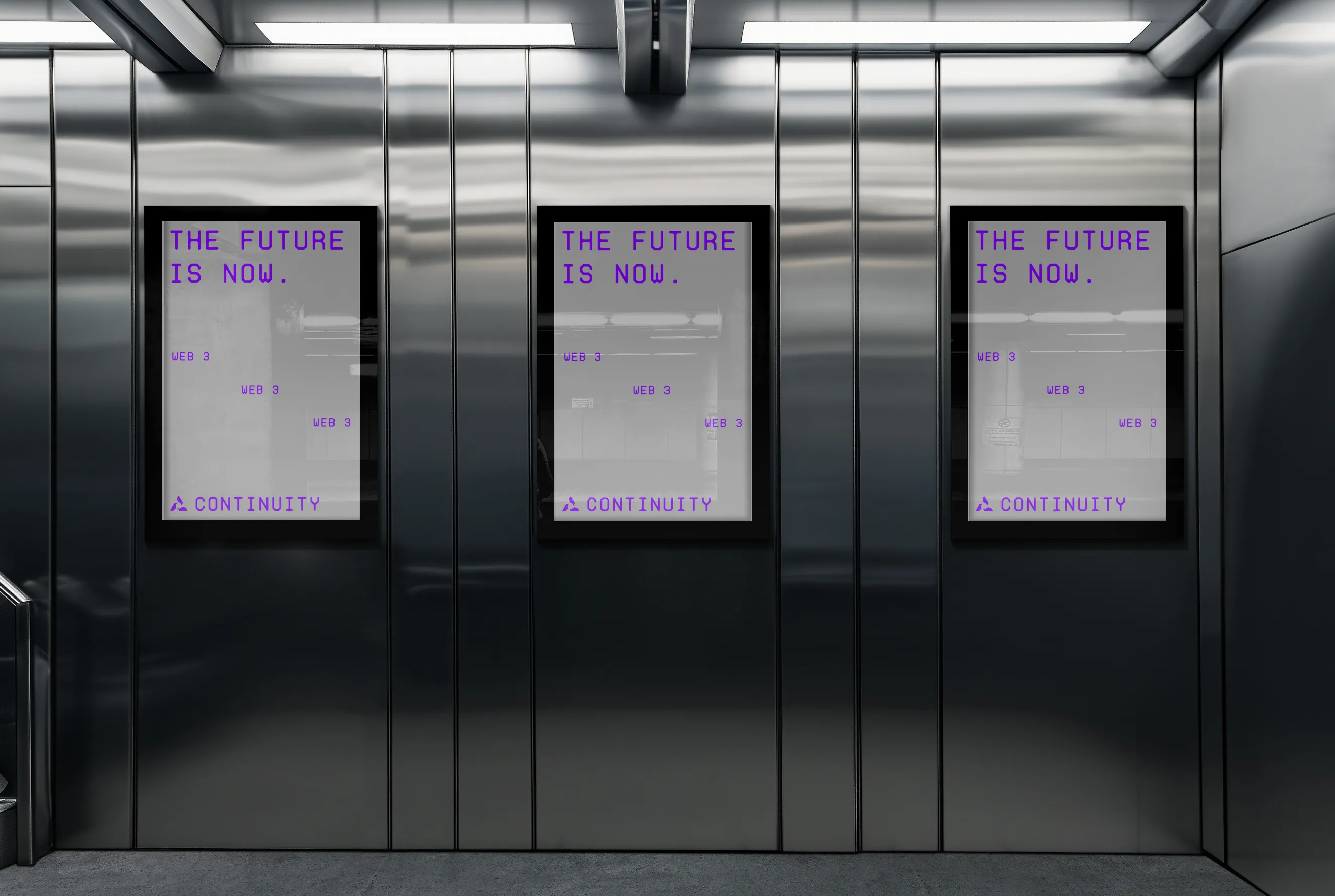
The proposal focused on a minimalist grid system, restrained motion feedback, and a digital identity that made performance and clarity feel like part of the brand.
Beta retention onboarding completion rate improved 46% compared to the previous prototype, session depth per user rose from 2.1 to 5.8 sessions/week, and the Continuity MVP landed three mid-market design-partnerships within the first quarter that specifically cited the cohesive brand-to-product motion story as a primary reason for selecting Continuity over more established competitors. The final outcome tied brand, interface, and motion into one cohesive product story built to earn trust and feel modern on the web.
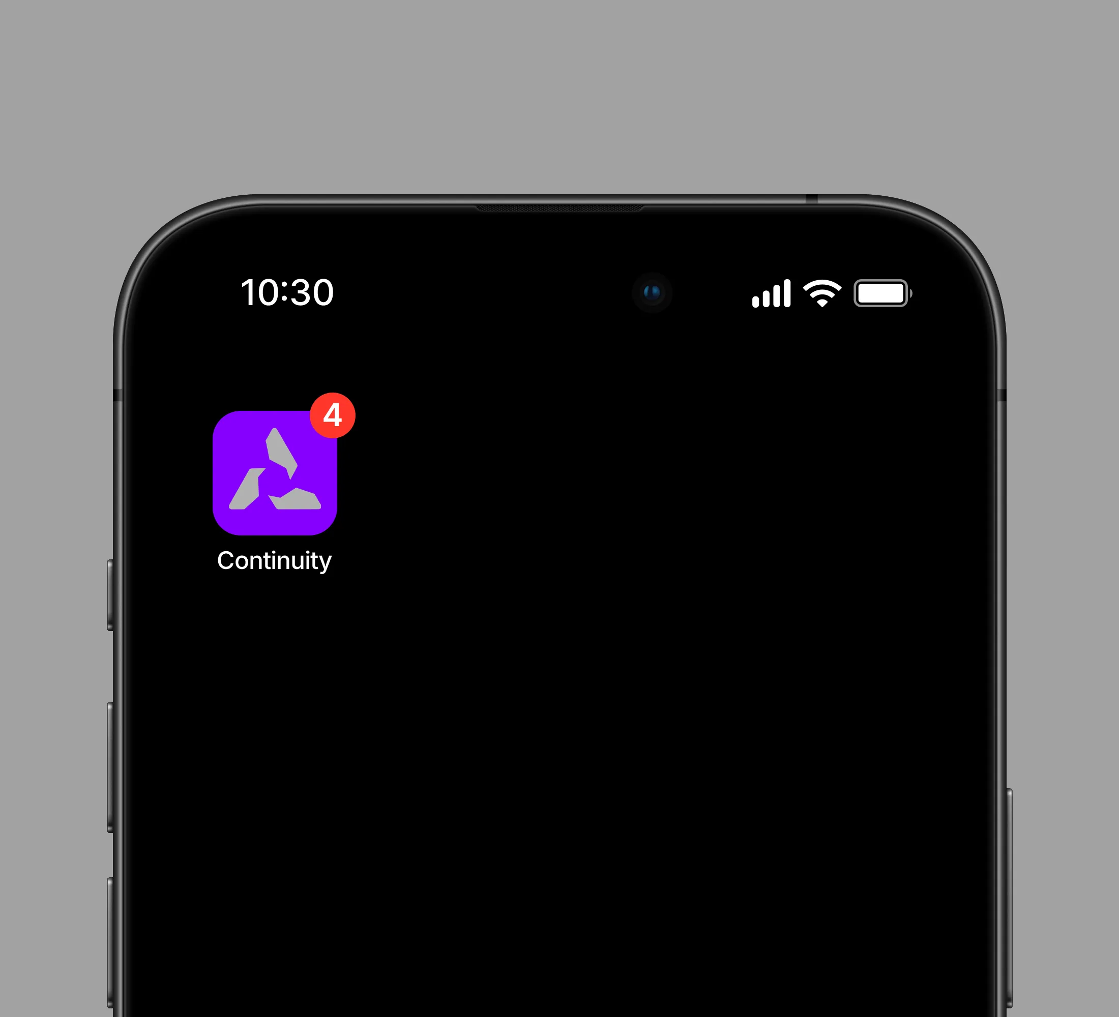
Continuity was conceived as a software-facing brand and product system that needed to communicate seamless persistence from first glance to product interaction.
YEAR
2026
ROLE
BRAND DESIGNER
CREATIVE STATEGIST
SERVICES
BRAND DESIGN
We positioned Continuity as the quiet backbone of reliable digital infrastructure — a product for mid-market teams that value compounding reliability over flash. The strategy was to let the motion itself become the brand: every transition reinforces continuity; every interface pattern reads as a deliberate, considered choice with no dead ends. We set three rules: zero jarring state changes are prohibited, grids stay visible across pages, and transitions match the grid, and every primary motion is consistent with the mark’s structural geometry. This moved the positioning from “just another SaaS tool” to a platform that earns trust through micro-interactions.
We developed the visual language in Figma, translated that logic into a React build, and used motion studies to test how the interface could reinforce the idea of continuity.
The proposal focused on a minimalist grid system, restrained motion feedback, and a digital identity that made performance and clarity feel like part of the brand.
Beta retention onboarding completion rate improved 46% compared to the previous prototype, session depth per user rose from 2.1 to 5.8 sessions/week, and the Continuity MVP landed three mid-market design-partnerships within the first quarter that specifically cited the cohesive brand-to-product motion story as a primary reason for selecting Continuity over more established competitors. The final outcome tied brand, interface, and motion into one cohesive product story built to earn trust and feel modern on the web.
Continuity was conceived as a software-facing brand and product system that needed to communicate seamless persistence from first glance to product interaction.
YEAR
2026
ROLE
BRAND DESIGNER
CREATIVE STATEGIST
SERVICES
BRAND DESIGN
We positioned Continuity as the quiet backbone of reliable digital infrastructure — a product for mid-market teams that value compounding reliability over flash. The strategy was to let the motion itself become the brand: every transition reinforces continuity; every interface pattern reads as a deliberate, considered choice with no dead ends. We set three rules: zero jarring state changes are prohibited, grids stay visible across pages, and transitions match the grid, and every primary motion is consistent with the mark’s structural geometry. This moved the positioning from “just another SaaS tool” to a platform that earns trust through micro-interactions.
We developed the visual language in Figma, translated that logic into a React build, and used motion studies to test how the interface could reinforce the idea of continuity.
The proposal focused on a minimalist grid system, restrained motion feedback, and a digital identity that made performance and clarity feel like part of the brand.
Beta retention onboarding completion rate improved 46% compared to the previous prototype, session depth per user rose from 2.1 to 5.8 sessions/week, and the Continuity MVP landed three mid-market design-partnerships within the first quarter that specifically cited the cohesive brand-to-product motion story as a primary reason for selecting Continuity over more established competitors. The final outcome tied brand, interface, and motion into one cohesive product story built to earn trust and feel modern on the web.