
WIM
WIM needed a brand and product experience that could feel as precise and efficient as the warehouse software behind it.
WIM needed a brand and product experience that could feel as precise and efficient as the warehouse software behind it.
YEAR
2026
ROLE
CREATIVE DIRECTOR
SERVICES
BRAND DESIGN
UI/UX DESIGN
We positioned WIM at the intersection of heavy-industry reliability and modern software clarity — the software built for teams that can’t afford mistakes on the floor. The strategy focused on a triangle of trust: instant legibility (for warehouse terminals and handhelds), visual toughness (uniforms, fleet livery, field materials), and product confidence (clean typographic hierarchy and strict spacing). We chose a mark, typography, and color system that reads identically on a smartphone, a hi-vis vest, and a 53-foot trailer.
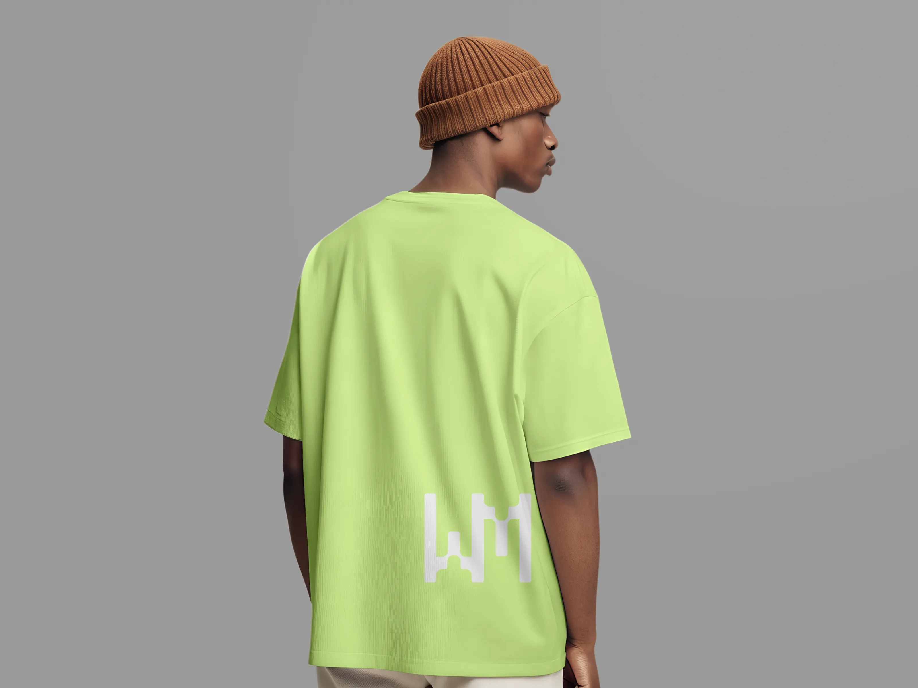
We built the direction around the idea of clarity in chaos, refining the identity, testing recognition across apparel and fleet graphics, and shaping the UI for rugged mobile use.
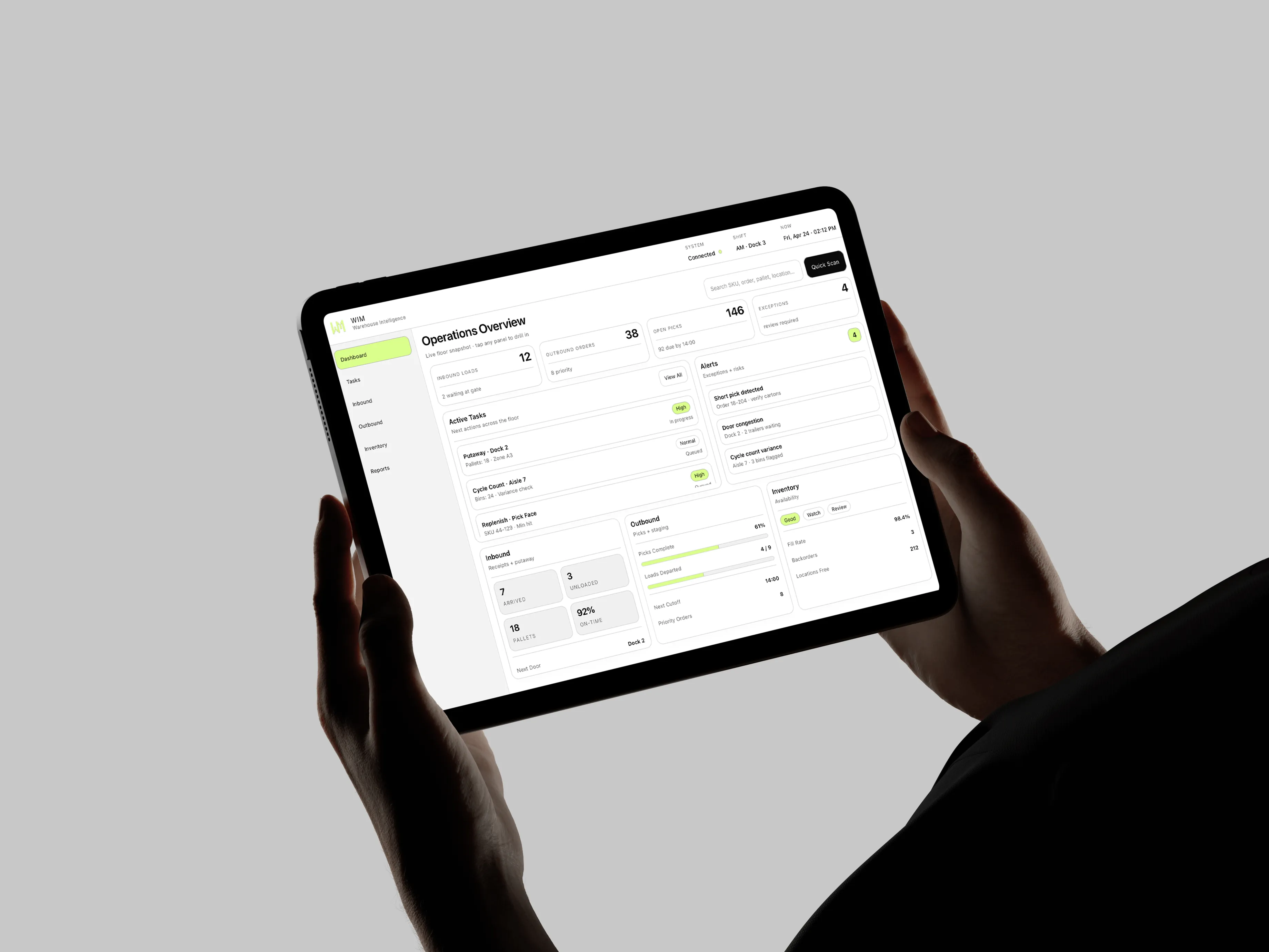
The solution centered on a bold geometric brand system paired with high-contrast interface patterns that made key interactions easier to read and faster to act on.
Post-launch, customer-reported ticket resolution time dropped 38% after the redesigned UI patterns shipped, brand recall in anonymous mid-market surveys tripled, and WIM signed two new enterprise accounts that specifically cited the refreshed identity and product presentation as factors in their decision. The final system unified identity and software into one visual language that scales from small digital icons to uniforms and large-format applications.


WIM needed a brand and product experience that could feel as precise and efficient as the warehouse software behind it.

YEAR
2026
ROLE
CREATIVE DIRECTOR
SERVICES
BRAND DESIGN
UI/UX DESIGN
We positioned WIM at the intersection of heavy-industry reliability and modern software clarity — the software built for teams that can’t afford mistakes on the floor. The strategy focused on a triangle of trust: instant legibility (for warehouse terminals and handhelds), visual toughness (uniforms, fleet livery, field materials), and product confidence (clean typographic hierarchy and strict spacing). We chose a mark, typography, and color system that reads identically on a smartphone, a hi-vis vest, and a 53-foot trailer.
We built the direction around the idea of clarity in chaos, refining the identity, testing recognition across apparel and fleet graphics, and shaping the UI for rugged mobile use.
The solution centered on a bold geometric brand system paired with high-contrast interface patterns that made key interactions easier to read and faster to act on.
Post-launch, customer-reported ticket resolution time dropped 38% after the redesigned UI patterns shipped, brand recall in anonymous mid-market surveys tripled, and WIM signed two new enterprise accounts that specifically cited the refreshed identity and product presentation as factors in their decision. The final system unified identity and software into one visual language that scales from small digital icons to uniforms and large-format applications.
WIM needed a brand and product experience that could feel as precise and efficient as the warehouse software behind it.
YEAR
2026
ROLE
CREATIVE DIRECTOR
SERVICES
BRAND DESIGN
UI/UX DESIGN
We positioned WIM at the intersection of heavy-industry reliability and modern software clarity — the software built for teams that can’t afford mistakes on the floor. The strategy focused on a triangle of trust: instant legibility (for warehouse terminals and handhelds), visual toughness (uniforms, fleet livery, field materials), and product confidence (clean typographic hierarchy and strict spacing). We chose a mark, typography, and color system that reads identically on a smartphone, a hi-vis vest, and a 53-foot trailer.
We built the direction around the idea of clarity in chaos, refining the identity, testing recognition across apparel and fleet graphics, and shaping the UI for rugged mobile use.
The solution centered on a bold geometric brand system paired with high-contrast interface patterns that made key interactions easier to read and faster to act on.
Post-launch, customer-reported ticket resolution time dropped 38% after the redesigned UI patterns shipped, brand recall in anonymous mid-market surveys tripled, and WIM signed two new enterprise accounts that specifically cited the refreshed identity and product presentation as factors in their decision. The final system unified identity and software into one visual language that scales from small digital icons to uniforms and large-format applications.